
Having worked with both Mari and Charlotte before, I was asked to create promotional material for 'De selektive,' including posters (it has been staged in a number of locations) and flyers. I decided to take this opportunity to show a few steps in the creation of the poster.
The poster
Mari wanted a colourful poster, with bright yellow, pink, orange, and purple. She wanted a collage-like feel over it with a few different elements stuck on: a doll with Down's Syndrome (created by Marianne Kopała), a rosette of pregnancy tests featuring ridiculous 'results,' and a pregnant doll showing the foetus in her belly. Finally, speech balloons and Courier New were important. This is the final result. Keep scrolling for the bits and pieces.

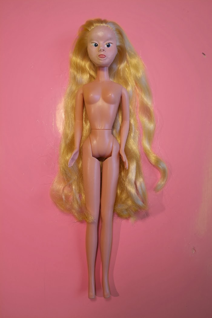
Doll and blister pack
The doll (nicknamed Downsie) had been photographed against a yellow background:

I fixed the nose which had had a bit chipped off and smoothed the face with a light Gaussian Blur as well as lightening it a little to make it look more like the rest of the plastic body. Changing the background colour to pink completed the look for the next step:
Using this incredibly detailed tutorial, I created a blister pack to make the doll look like an off-the-shelf toy and added a brand name plus small toy hairbrush as a final touch:

Rosette
The next item was the rosette of pregnancy tests. I started out by drawing two simple shapes with the Pen Tool and gave them a blue and white colour (which seems to be their preferred colour scheme):

I combined the shapes and gave them the following Layer Styles to create a three dimensional look:


A screen was added and given these Layer Style settings:

The 'test result' 'sengevæter' (bed-wetter) was added. Final look:

I then copied the test four times and rotated each slightly. Since I had the Use Global Light box in Layer Styles ticked, the shadows and highlights shifted as the tests were rotated into place.

Note: realistic light and shadow was not something I paid attention to for the rest of the poster because of the intended collage-look.
Suitably provocative test results were added to the other screens (psychopath, red hair and freckles, boy, ADHD):
Combining the elements
For the poster's background I used a shot of the same yellow table top used in the doll photograph. I added a picture of another doll, this one pregnant with the baby showing:

I masked out the edges of the picture to blend it into the background, added the following settings to brighten up the result and put the blister pack and rosette in place:


And finally, some sponsor logos and speech balloons with venue details and other information. The end result:

Note: I usually switch to InDesign after created the background and other elements, but I used Photoshop for so much of it that I decided to stick to it for the whole project. If you do, just remember to manually create the bleed and crop marks from the very start!
I hope you enjoyed this look behind the scenes!
No comments:
Post a Comment